Karam Coffee Branding and Corporate Identity
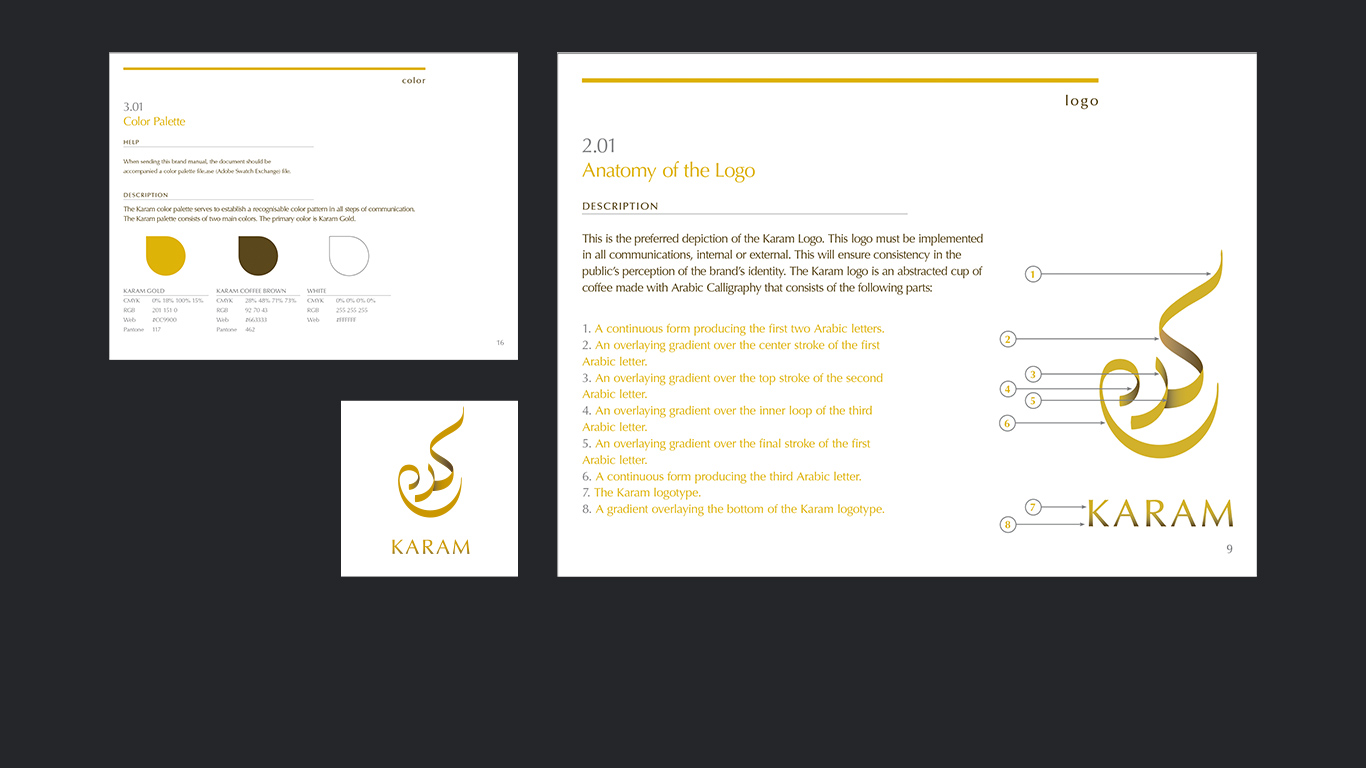
Karam Coffee is an Emirati coffee brand with roasting facilities based in Al Quoz, Dubai. The Karam logo is a calligraphic representation of the word “Karam” that appears to have been created using a gold ribbon. The Arabic logo form is also meant to double as a steaming coffee cup.
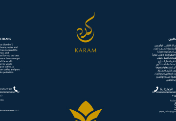
Karam Coffee Packaging
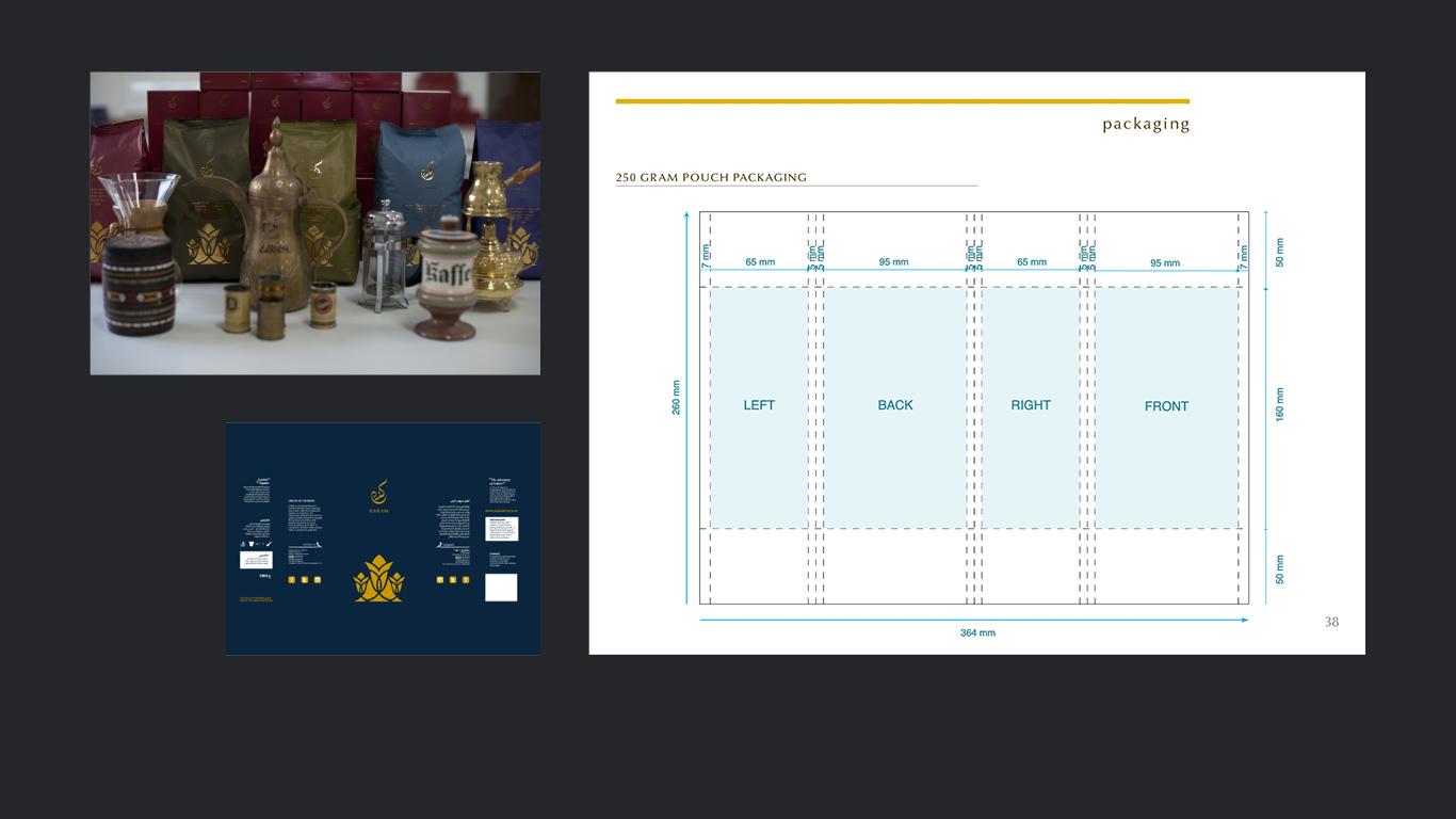
Karam product packaging is meant to be simple & elegant, yet attractive & eye–catching. Karam packaging always employs a vibrant color palette complemented with shining gold. The combination subtely communicates luxury at an affordable price.

Karam Coffee Website
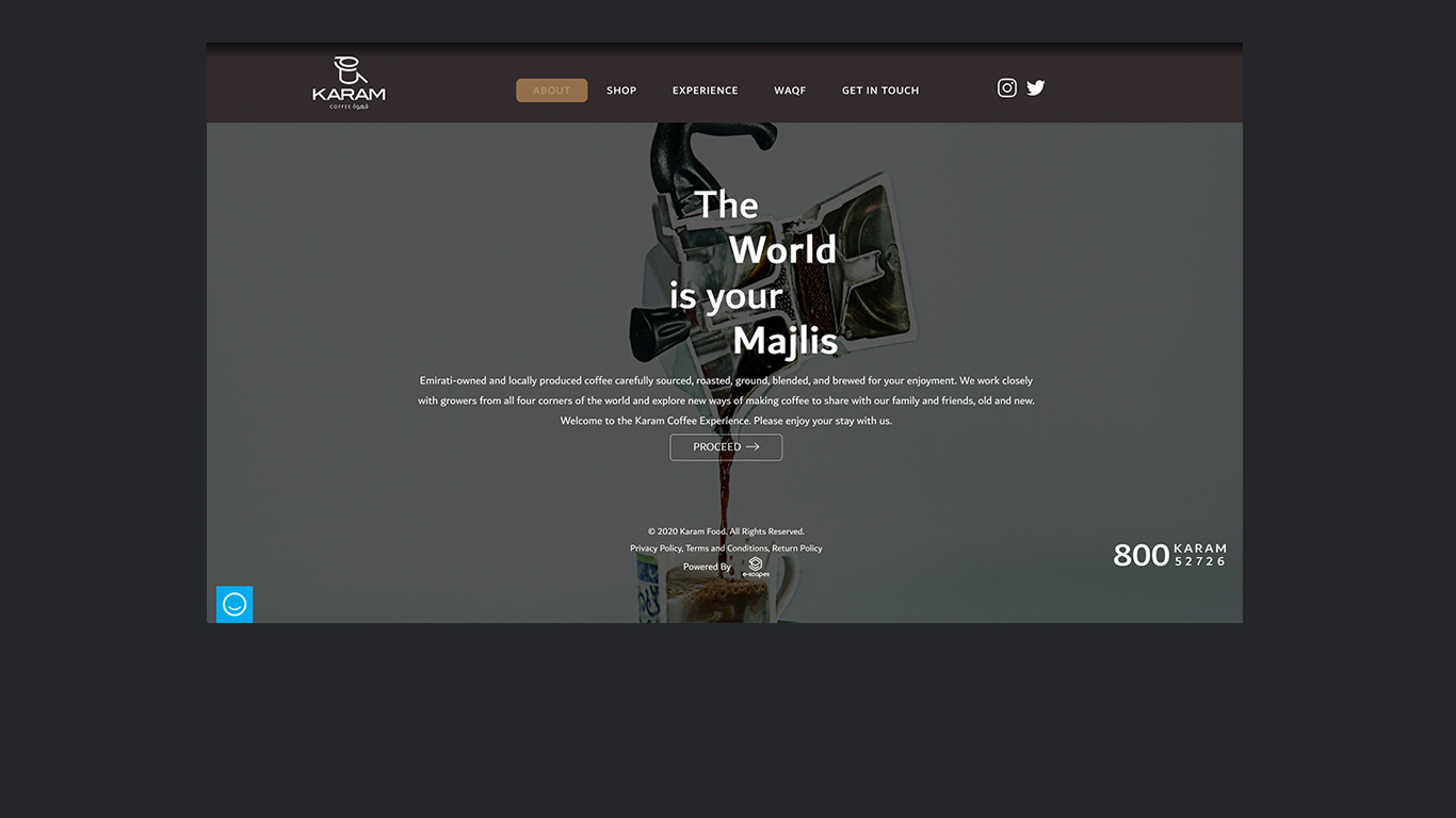
Karam Coffee's website was contracted to be redesigned in 2019. The challenge was to create a website that met contemporary best practices and web standards that was also responsive and built using "mobile-first" principles. The website desugn also had to integrate their existing e-commerce backend.
Visit Website
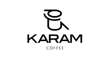
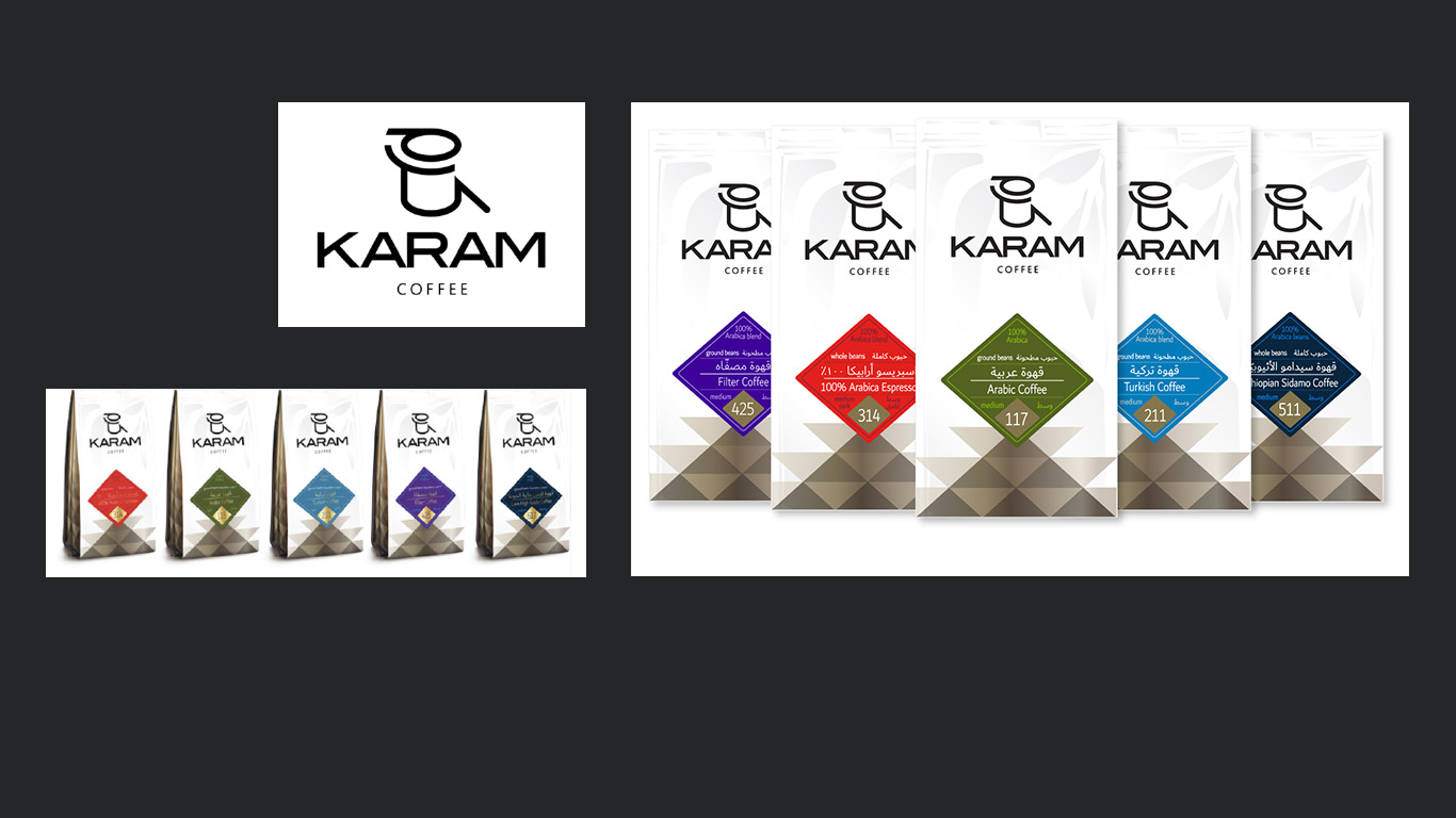
Karam Coffee Branding and Packaging Redesign
The logo was redone to feel sleek, elegant, contemporary. The Arabic logo form was made less calligraphic, but still made to appear as a coffee peripheral; a little pot for brewing Arabic or Turkish coffee, or the portafilter handle from a coffee machine. The packaging was also resdesigned to feel more contemporary and given a Western themed overhaul.
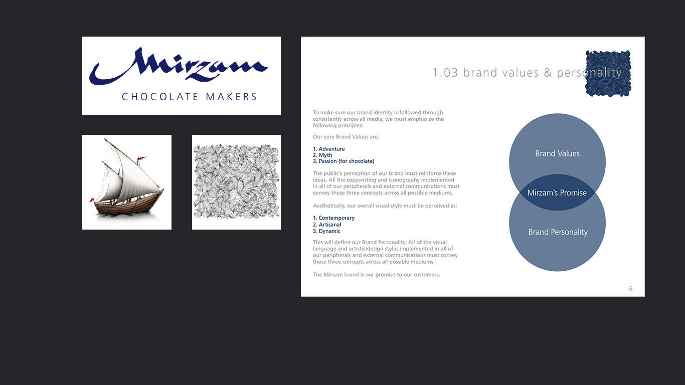
Mirzam Chocolate Makers Branding and Corporate Identity
Mirzam is cocoa bean to chocolate bar production facility with an onsite retail consumer experience that combines dark chocolate with Middle Eastern flavors.
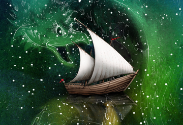
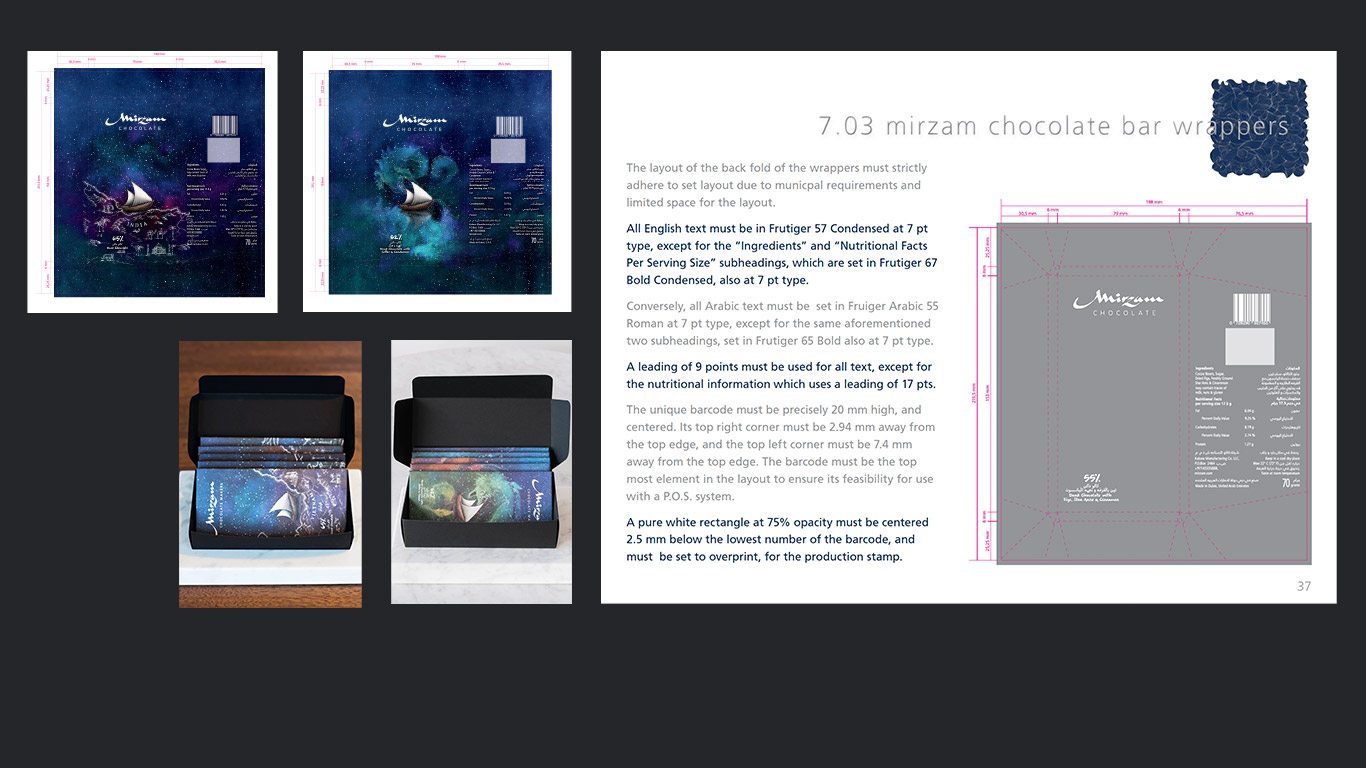
Mirzam Chocolate Makers Packaging
Mirzam product packaging uses elements of traditional artisitic skills like painting & illustration. Mirzam packaging is meant to immediately wow the viewer, and fill them with a sense of wonder and excitement. It is also meant to have the sense of being a collectible piece of artwork.
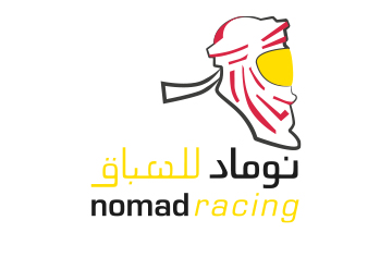
Nomad Racing Logo and Corporate Identity
Nomad Racing is the licensed distributor of Kosmic racing machines and products in the MENA region. They wished to have their Emirati identity communicated clearly aside with a sense of speed and competition. The result was an abstracted racing helmet wrapped in a simplified Emirati ghuttra.
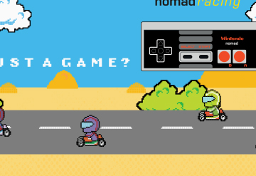
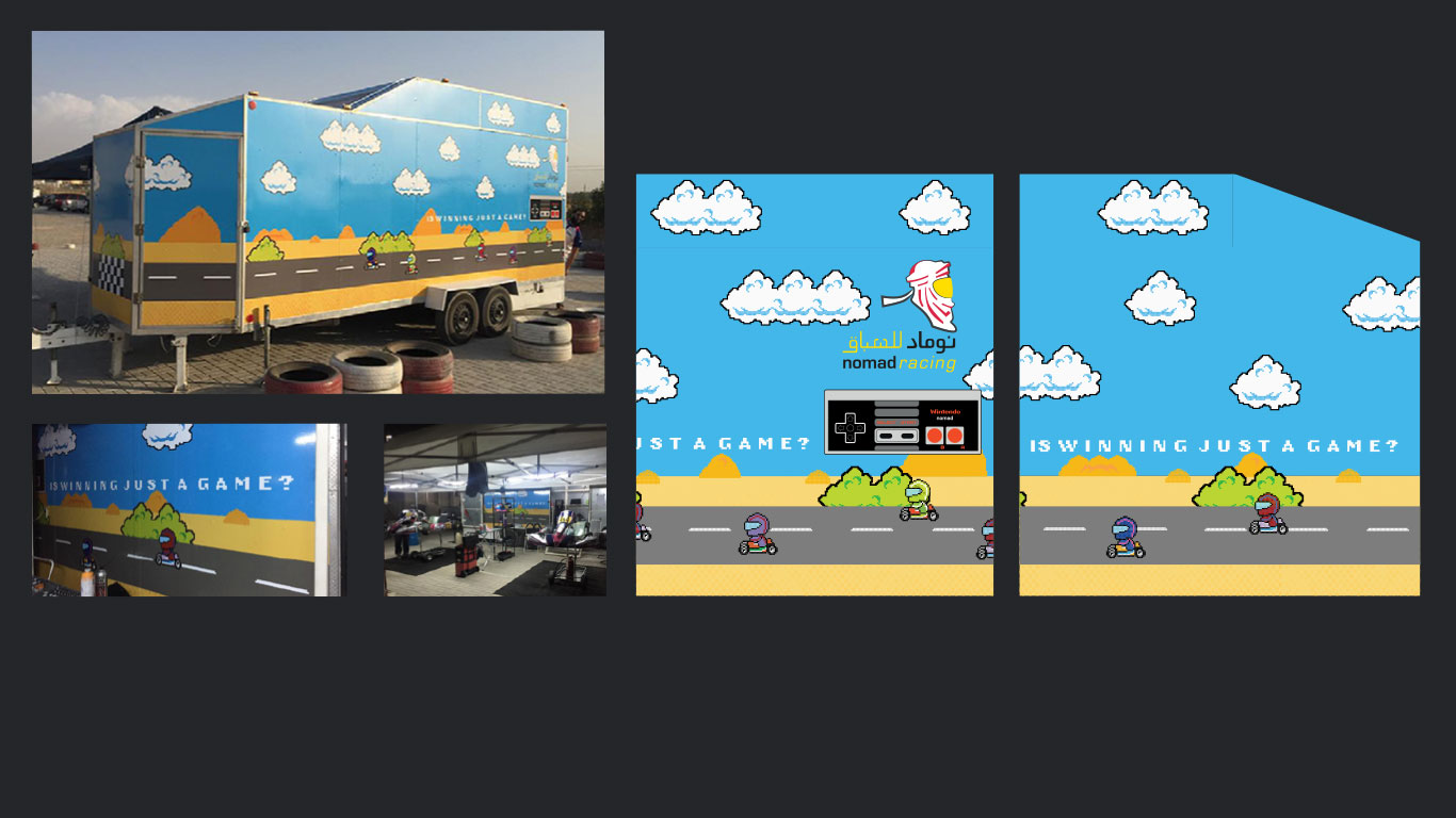
Nomad Racing Trailer
To use the space (a three dimensional trailer) effectively, a concept of a race around continuous race around the facade of the trailer was conceived. The artwork was stylized as a retro 8-Bit Nintendo racing game using a grid. The karts depicted on the artwork were recreated from the old Mario Kart racing game which was on the NES console.
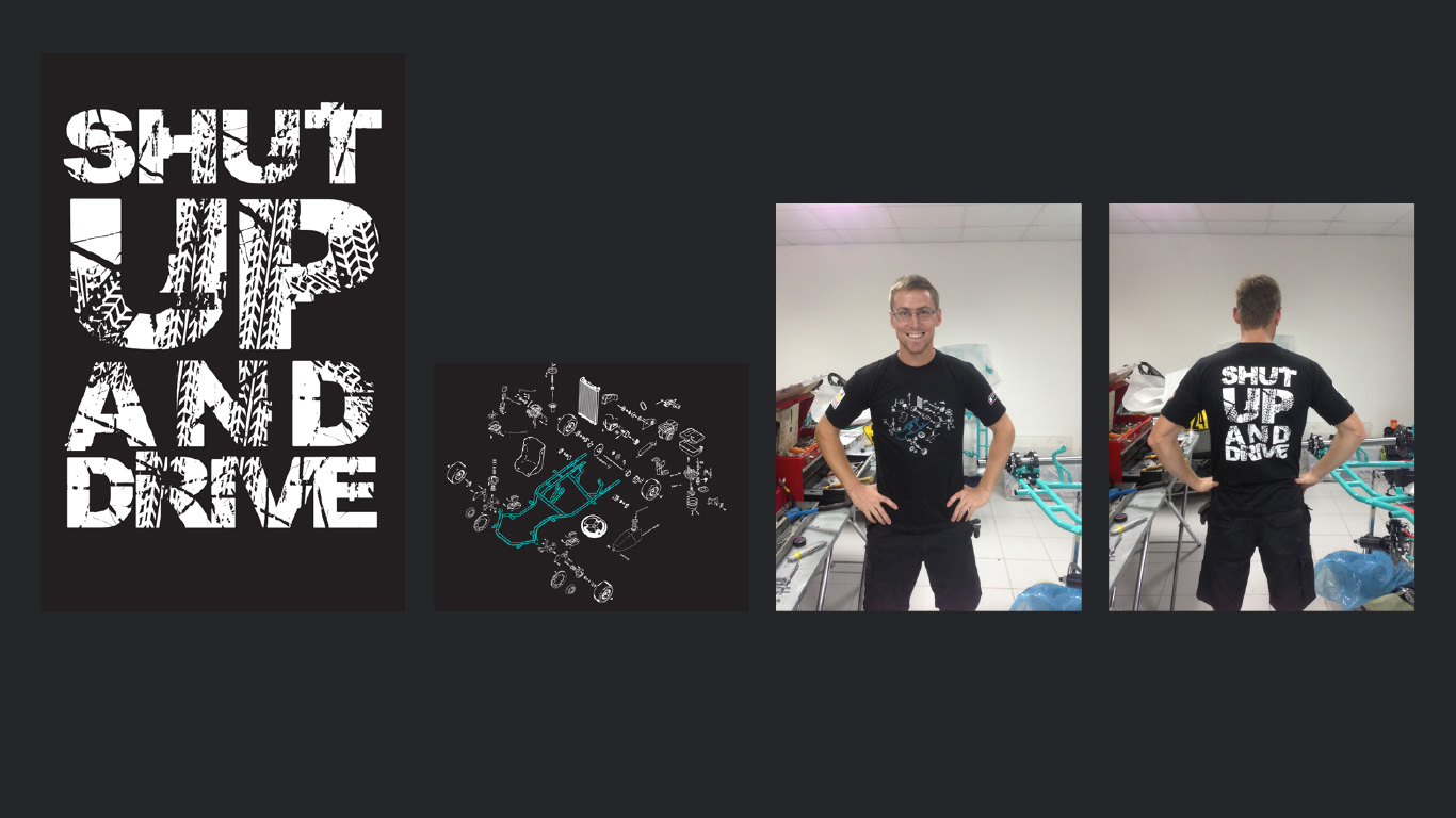
Nomad Racing T-Shirt
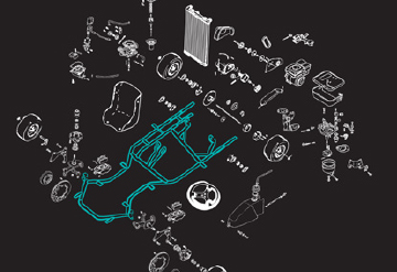
The design was inspired by those technical isometric diagrams of mechanical parts fitting together. The go–kart was studied and deconstructed. All of the parts within the graphic were hand–drawn and vectorized, or drawn with a stylus
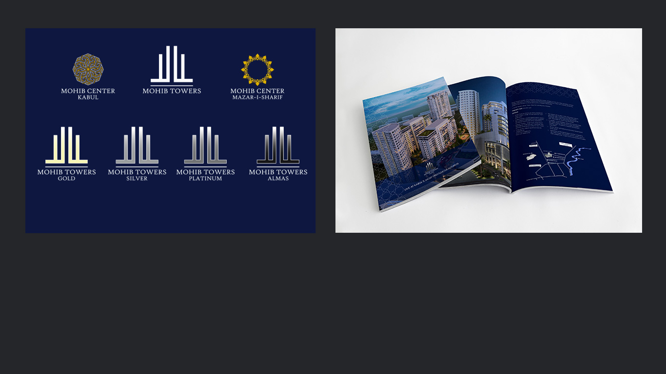
Mohib Towers Branding and Brochures
Mohib Towers is a mixed-use development in Kabul Afghanistan, headquartered in Dubai, U.A.E. A logo and branding was developed for promotional purposes and brochures were created, both in English and Dari, to market the commercial and residential properties.
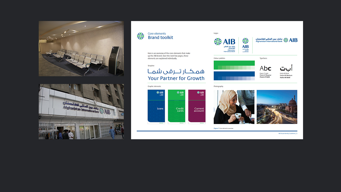
Afghanistan International Bank Branding & Signage
Afghanistan International Bank is a bank based in Kabul, Afghanistan, with headquarters in Dubai, U.A.E. A logo and bilingual branding was developed. Signage and internal artwork to be implement in their branches followed.
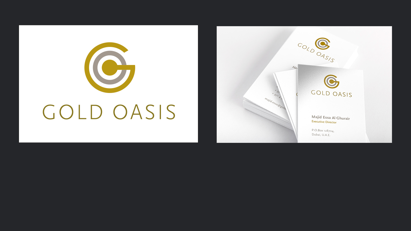
Gold Oasis Logo and Coporate Identity
Gold Oasis is a Dubai-based startup for refining and trading gold. The logo was created combining the visual elements of a smelter and the layered concentric look of an oasis viewed from above.
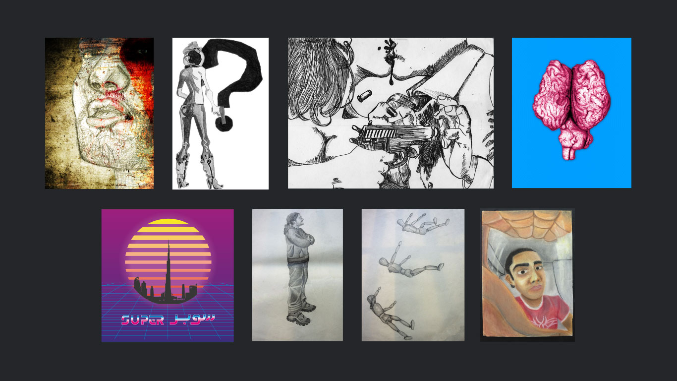
Miscellaneous Artwork and Illustrations
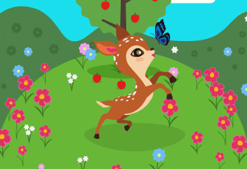
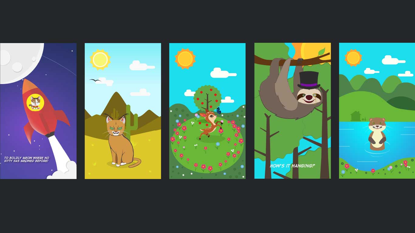
Animal Illustrations